Impeccable copy, finest acting, inspiring frames and the absolute truth. Simply brilliant!
Food is a healer, binder and make-fonder in Indian families, and this has been beautifully captured here. Though this is the original 1 minute version, the 15/30 sec edits on TV also convey the same emotions with no loss of value.
I have nothing else to say about this ad. I mean, what can I?!
Lowe Lintas and Partners, kudos!
It's just that. An Observatory. A decade+ experience in the world of advertising can, if not anything else, teach you to identify ads--good and bad, the moment you see it. Since it is all about 'creativity', as they say, it becomes more important that one knows what he should not do.
Sunday, 17 August 2014
Saturday, 16 August 2014
'Feels That Bad' in the end - Volkswagon Polo
A nice ad tapping the sentiments of the second child.
He always gets second-hand stuff, from books to uniform to shoes to cycles. He looks at the older brother with longing. Natural.
Now this is where we all expect a major twist in the tale. But does it happen? Well, I wouldn't be writing this if it had, right?!
Looks like the director/writer didn't know how to end this. The last shot shows a guy driving a Polo overtaking another car. It is fair to expect viewers to assume that the guy driving the Polo is the younger one and the other driver is the older brother. Is it obvious? No. Will people miss it? Definitely. But the bigger issue here is this. Since the other car is never shown, for all you know, the other guy could be driving a BMW!!
My point here is very simple. Viewers expect a twist in the tale and there's nothing here. A sad ending to an ad beautifully begun. Really 'feels that bad' in the end!
DDB Mudra.. expected more after the Union Bank ad.
Wednesday, 13 August 2014
Delsey-ly Unreal!
I know of slice-of-life ads, I-wanna-be (aspirational) ads, anything-but-true funny ads, functional ads, etc. But a stupid, it-means-nothing ad is difficult to come across. I found one! But trust me, I'm not delighted. It is definitely not like finding truffles! It is more like finding a rotten mushroom.
Okay, just see this one.
10 marks to anyone who can tell me why this visual was used!
Well, let see. It is Delsey Paris, so the Eiffel Tower. It is unisex, so we have a male and female. Fashion product, so swankily dressed models (on a cycle?????). What a way to put together an ad! What I just can't seem to understand is why the hell the woman is pulling the suitcase while on the cycle! Who does that?!!!! WHO DOES THAT??!!
I don't know who the agency is, but I think they were playing Lego while making this ad. Label the blocks with all that you want and then just pile them up!
Oh, I forgot the discount bit. That's there too.
Saturday, 2 August 2014
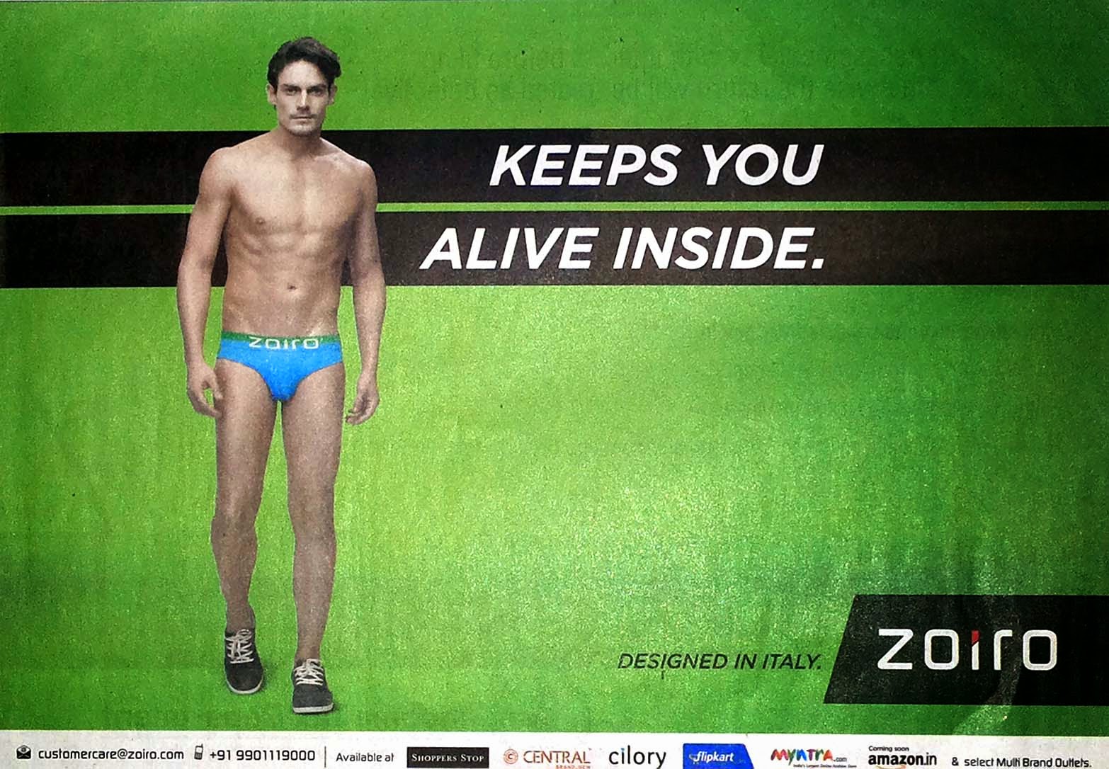
Zoiro finds a cure for ADHD
Is this what was meant to be said?
Nice colours and a good layout. But if this was meant to be for men with ADHD (Attention Deficiency Hyperactivity Disorder), why show a young man? [please do read between the lines!]
Well, I get it that you are trying to be creative, but in my opinion, this is not even remotely close to what men want. Or even women, for that matter!
Creativity for the sake of it sucks! Another of those 'kuch bhi' ads!
Friday, 1 August 2014
100% off track?
Really??? "Shoe Love is True Love"???
Is this all the agency could think of? Or this could be a great way to punish a client who does not pay!
This ad is the result of a great combination of a rookie writer and a veteran account manager. The rookie writer comes up with such lines and the veteran account manager sells it to clients.
It is when I see ads like this that I think that ads don't need headlines at all.
Seriously, kuch bhi, eh?
Subscribe to:
Comments (Atom)


